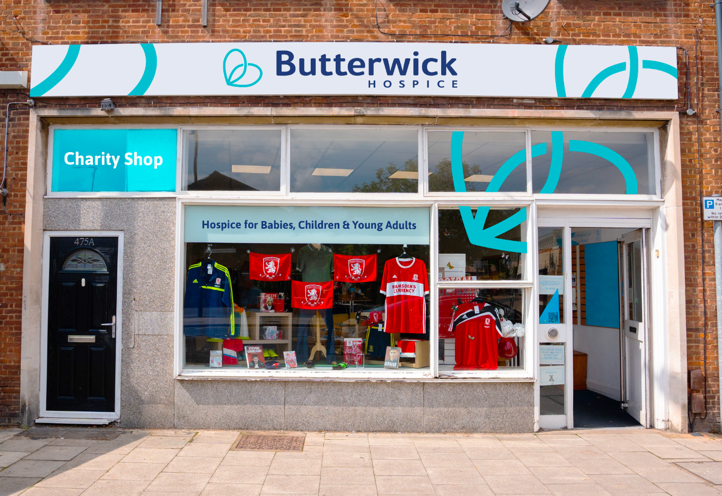
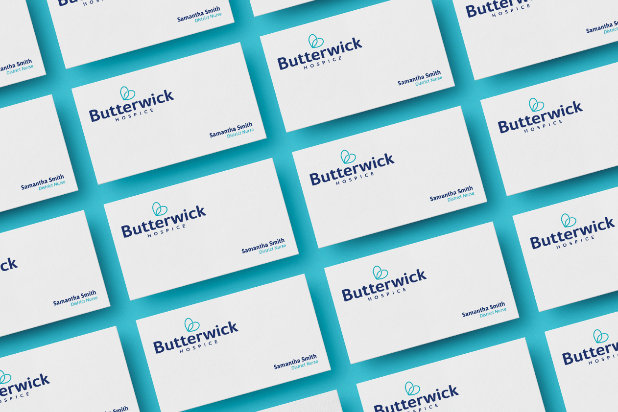
The goal of this project was to refresh Butterwick Hospice’s visual identity, creating a more cohesive and modern brand that truly reflects its warm, inclusive, and supportive care. The previous branding felt outdated and somewhat disorganised, failing to represent the hospice’s recent improvements and the progress made to enhance its services.
To address this, the new brand identity was designed to feel more welcoming, caring, and supportive, ensuring that it aligns with the hospice’s core values. The refresh brings a sense of warmth and trust, making the brand more approachable for service users, families, and the wider community. While modernising the look and feel, the colours were carefully chosen to stay close to the original palette, maintaining a strong connection to the existing brand and ensuring familiarity.
The updated design evokes emotions of safety, support, and positivity—like a reassuring hug. By strengthening the visual identity, the rebrand allows Butterwick Hospice to better communicate the compassion and care it provides every day.

